
Our designs · November 11, 2026
What to put on every page of a wedding photographer's website
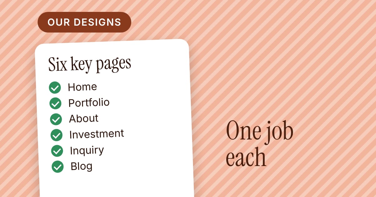
A wedding photographer's website does not need many pages, but each one has a job. Here are the six couples look for, what each should do, and the mistake we see most on each.
A couple looking for a wedding photographer is usually doing it on a phone, in a spare ten minutes, with three or four tabs open. They are asking two things: do I like these pictures, and can I picture this person at our wedding?
Your website has a short time to answer both. The good news is that it does not need many pages. It needs the right six, each doing one job. Here is what each page is for, what belongs on it, and the mistake we see most often.
1. Home: say who you are and show your best work
Its job: within a few seconds, tell a visitor what you photograph, where, and what your pictures feel like.
What belongs on it: one strong photograph that fills the screen on a phone. One line about who you are ("Documentary wedding photography in the Hudson Valley"). A few more frames. One clear button to look at your portfolio or get in touch.
The common mistake: a slideshow of twelve pictures with no words. A visitor sees pretty images and still cannot tell whether you work in their city or at their kind of wedding.
2. Portfolio: a few full weddings, not a hundred pictures
Its job: show how you work across a whole day, not only your ten best frames.
What belongs on it: several weddings, each told in a handful of pictures in order: getting ready, the ceremony, portraits, the party. A line or two about the place and the day. Different light, different seasons, different kinds of couples.
The common mistake: an endless grid. A couple cannot take in a hundred pictures, and a few weeks later cannot remember any of them. Fewer, in order, with a sentence of context, is easier to take in and easier to trust.
3. About: you, in a way a couple can picture
Its job: make a stranger comfortable with the idea of you standing next to their family on the day.
What belongs on it: a real photograph of you, a few warm and plain sentences about how you work and what you care about, and how you handle the part couples worry about (a nervous family, a delayed timeline, a rainy afternoon).
The common mistake: a page that reads like a résumé. Couples are not hiring a list of equipment and years; they are choosing someone to trust.
4. Investment: what it costs, or how to find out
Its job: help a couple decide whether to write to you, without surprise later.
What belongs on it: at least a starting point, or your packages with what each includes. Sources disagree on how much to show: some photographers show every price, some say "starting at", some ask people to inquire. Pick one on purpose. A short line on how booking works (retainer, contract, a call) also helps.
The common mistake: a page that says nothing. If a couple cannot tell whether you are in their range, many will simply not ask.
5. Inquiry: ask for the date first
Its job: make writing to you easy and give you what you need to reply well.
What belongs on it: names, email, wedding date (with a "still deciding" option), the venue and a box for anything else. Keep it short. Say when you usually reply.
The common mistake: a long form on a small phone screen. Every extra field costs you some inquiries. Ask for what you need to answer the first message and leave the rest for the conversation.
6. Blog: real weddings, real places
Its job: give couples more of your work to read, and give search engines pages about the places and subjects couples search.
What belongs on it: short stories from real weddings, with a handful of pictures, the venue's name, and a few lines about how the day went. Add posts you would be glad for a couple to read, not a daily log.
The common mistake: starting enthusiastically and stopping after four posts. A modest blog you keep up beats a big one you abandon: one honest post after a wedding you loved shooting is plenty.
What you can skip
You do not need a page for every service, a page of testimonials separate from the rest, or a shop on day one. Put a line or two of kind words from past couples on the home and About pages, and add more pages when a real need appears.
One check before you launch
Open your site on your phone, hand it to a friend, and say: "You are getting married in June. Find out whether this photographer would suit you and how to ask." Watch what they do without helping. Wherever they hesitate is the page to fix first.
How this fits a PageTend Studio design
Most of our designs come with these pages already in place, a portfolio, an About page, an investment or packages page, an inquiry page and a blog, so you start from a finished layout and add your own pictures and words. Nothing to download or install: we host your site, and you change your words and photos in a simple editor in your web browser, or have us do it on the fully managed plan. You can look through the live demos on the Designs page, see what comes with each plan on the Pricing page, or write to us if you want something made to measure.
Looking for a website that is ready when you are?
Browse the live demos, see what comes with each plan and make one yours. Nothing to download or install: we host your site.
More posts
 What a wedding photographer's inquiry form should ask, and what to do nextThe inquiry form is where a visitor becomes a possible booking. Here is what to ask first, which fields quietly cost you inquiries, and a simple first reply that keeps the conversation going.
 How to write a wedding blog post that is not a diaryMost wedding blog posts are a gallery with a thank-you. Here is an outline that turns a wedding into a short story couples can use: the place, five frames, one useful detail and a closing line.
 How couples find a wedding photographer by venue, and what to put on the pageCouples plan around a place, so they search for the place. Here is what a venue page is, what belongs on it, the mistakes to avoid, and how to start with your five most-shot venues.